
Your sales deck looks polished, but deals are still stalling. The problem isn’t the quality of your visuals. It’s that your presentation effort doesn’t match the stakes of the moment. People who aren’t interested in your presentation are likely to bounce within the first ten seconds. So, how can you get over this hump and create an engaging visual presentation that works?
Our blog will guide you as you learn how to match your visual presentation investment to the audience, context, and business impact of each sales moment, so you can close more deals without burning out your team.
Learn more: Sales Presentation Guide: The Complete Framework, Templates, and Virtual Best Practices
What’s Breaking Your Visual Presentation?
Your sales deck is underperforming because there’s a mismatch between your design effort and the specific needs of your audience, the stakes of the deal, and your delivery method. Before you start refining slides, step back and define the job to be done for your presentation. Is it to provoke new thinking? Showcase unique value? Build credibility? Let that core purpose guide where you invest design effort and where you streamline.
Pro Tip
Write your presentation’s “job to be done” in one sentence and place it at the top of your working deck. If a slide doesn’t support that job, it doesn’t belong.
Once you’ve clarified the business moment, evaluate each visual element. Is it reinforcing your core message and moving the sale forward, or just adding clutter? Fixing this misalignment is often the fastest path to better results, without overhauling your entire design process.
The Factors That Influence the Decision
A few universal factors have outsized impact on how your deck will be received and whether it will influence the decision:
- Stakes: How large is the deal, and how important is this meeting? Higher stakes demand more polished, purposeful visuals.
- Audience Familiarity: Are you presenting to well-informed buyers deep in evaluation or early-stage stakeholders unfamiliar with your offerings? Less context requires more visual support to build understanding.
- Delivery Mode: Will you walk through slides live, or send the deck as a standalone asset? If your presentation needs to speak for itself in an asynchronous setting, clarity and narrative flow are critical.
- Data Complexity: Does your message revolve around nuanced data or sophisticated analysis? Complex content requires clean, thoughtful visualizations to make insights accessible.
- Time and Resources: Sometimes the deciding factor is bandwidth. Under tight deadlines with limited design support, be extra judicious about where you invest effort for maximum impact.
Pro Tip
If three or more factors point toward higher complexity such as high stakes, unfamiliar audience, standalone delivery, it’s a clear signal to invest in stronger visuals and narrative structure.
By weighing these variables objectively, you avoid overbuilding decks for low-stakes meetings and under-preparing for make-or-break moments.
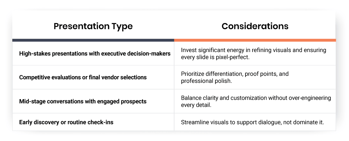
When Should You Keep Your Deck Minimal?
Not every sales conversation requires a highly polished deck. For early discovery calls, internal check-ins, or routine updates with familiar champions, a streamlined approach often works better. Simple, clean slides keep the focus on dialogue rather than presentation theater.
When you’re still exploring fit and gathering information, minimal visuals help you stay agile. You can pivot the conversation based on what you’re hearing without being locked into a rigid slide sequence. A few well-chosen data points and clear talking points are often all you need to move the conversation forward.
Pro Tip
For discovery calls, aim for slides that support conversation instead of completeness. If your deck answers questions your buyer hasn’t asked yet, it’s probably doing too much.
The key is recognizing when simplicity serves your goals better than polish. If the meeting is about building rapport, asking questions, or testing hypotheses, resist the urge to over-invest in design. Save your energy for moments where visual impact truly matters.
When a Polished Deck Is Worth It

When does a presentation require a different level of investment? Some examples are:
- Presenting to executive decision-makers
- Competing against other vendors
- Making a final pitch for a significant contract
Pro Tip
A polished deck leads to clearer thinking. Focus your effort on narrative flow, decision-driving visuals, and a strong opening and close.
Here’s the message you’re sending with a polished deck:
- Professionalism
- Attention to detail
- Understanding the gravity of the situation
- Respecting your audience’s time
When the business impact is substantial, investing in refined visuals, clear data visualization, and thoughtful narrative flow pays dividends.
How to Present Analyst Briefings or Board Reviews
When presenting to analysts, board members, or senior executives, your deck becomes a reflection of your company’s strategic thinking. These audiences expect sophisticated analysis, clear business logic, and professional presentation standards. Sloppy visuals or confusing charts undermine your credibility before you’ve made your case.
Invest time in:
- Creating a strong narrative arc
- Using precise language
- Ensuring every data point is accurate and well-sourced
Pro Tip
Assume your slides may be reviewed without you in the room. Clear sourcing, concise annotations, and defensible assumptions are non-negotiable at this level.
How to Present with Competition
When you’re head-to-head with competitors, your presentation quality can be the deciding factor. In these scenarios, buyers are comparing not just features and pricing, but the overall experience of working with each vendor. A polished, well-structured deck signals that you’ll bring the same level of rigor to implementation and support.
Focus on:
- Clarity
- Differentiation
- Proof points
- Visuals that make complex comparisons easy to understand
- A clear articulation of your unique value proposition on every slide
Are You Using Animation the Right Way?
Animation can enhance understanding or create distraction—the difference lies in purpose. Use animation strategically to control pacing and direct attention, not to add visual flair. When applied thoughtfully, animation helps audiences process complex information and follow your reasoning step by step.
The goal is to reveal information at the right moment, not to impress with technical effects. Every animated element should serve a clear communication purpose. If you can’t articulate why a transition or build is necessary, remove it.
Here’s how you can incorporate animation into your deck in an effective way:
- Reveal data points sequentially when walking through multi-step logic or building toward a conclusion.
Why This Works
It helps you control the narrative.
- Layer information progressively to give your audience time to absorb each point before adding complexity.
Why This Works
It keeps everything aligned with your reasoning and reduces cognitive overload.
- Highlight a specific trend line, dim secondary information, or spotlight a key metric.
Why This Works
It guides your audience’s eye, focuses attention, and reinforces your verbal narrative.
Are You Over- or Under-Investing?
The most common presentation mistakes are related to resource allocation. Teams often spend hours perfecting decks for routine meetings while rushing to prepare for high-stakes presentations.
Below are some tips on how you can avoid wasting time and undermining performance:
- Make confident, purposeful decisions about design investment and stick to them.
- Trust your judgement, set a clear scope for design effort, and execute against that plan.
- Focus on tightening narrative flow, sharpening key data points, and adding polish to a handful of hero slides if running low on time.
By aligning design investment with the unique needs of each sales moment, you create presentations that are both impactful and achievable—no late nights or last-minute panic required.
Pro Tip
Lock your level of design investment before you start building slides. Deciding upfront prevents scope creep and last-minute overwork.
How Much Should You Invest Right Now?
Translate your specific context and constraints into a practical level of visual polish for each presentation. Consider these factors:
If you’re preparing a standalone deck that will be reviewed asynchronously, your slides need to carry the full weight of your argument. Follow these guidelines:
- Create a strong narrative arc
- Use clear annotations and callouts to draw attention to key points
- Include written explanations for charts or graphs
How to Make Better Calls Next Quarter
True presentation mastery comes from operationalizing visual investment decisions at a team level. By establishing clear protocols and templates, you ensure everyone makes consistent, strategic choices about when and how to invest in presentation design.
Start with these foundational steps:
- Create baseline slide templates that reflect your brand identity and incorporate best practices for visual storytelling. Templates should be flexible enough to accommodate various content types while maintaining a cohesive look across all sales materials.
- Define clear guidelines around when to invest heavily in visual polish versus when a streamlined approach suffices. Base these rules on deal size, strategic importance, audience seniority, or other key factors.
- Set up a lightweight review process for pivotal sales moments like executive presentations, competitive bake-offs, or major contract negotiations. This creates an extra layer of quality control without bogging down the entire process.
- Build a library of modular visual assets that can be easily swapped into baseline templates. Tag assets by industry, buyer persona, or company size so your team can quickly assemble tailored decks.
With clear guidelines, strong templates, and a library of targeted assets, you’ll create compelling, customer-centric sales presentations without the last-minute scramble.
Conclusion
The key to effective visual presentation in sales is strategically matching your design effort to the stakes and story at hand. By right-sizing your investment, you protect your team’s time while maximizing impact where it matters most.
Salesgenie® helps you pinpoint your most promising prospects and tailor your sales approach to their specific needs, so you can focus your presentation effort where it will drive the greatest return. Match your visual investment to your audience and stakes, and you’ll earn the attention your ideas deserve and close more deals.
FAQs
The primary issue is a mismatch between your design effort and the specific needs of your audience, deal stakes, and delivery context. Over-investing in polish for low-stakes meetings or under-preparing for executive presentations creates a disconnect that can stall deals.
Consider five main variables: deal stakes and meeting importance, audience familiarity with your company, delivery mode (live vs. standalone), data complexity, and available time and resources. Higher stakes and less familiar audiences typically warrant more design investment.
Focus on ruthless prioritization rather than wholesale overhauls. Concentrate on tightening the narrative flow, sharpening key data points, and adding polish to a few hero slides. A few thoughtful tweaks can elevate the entire presentation without requiring extensive rework.
Slides sent standalone need to carry the full weight of your argument without your commentary. Focus on creating a strong narrative arc, use clear annotations and callouts for key points, and include written explanations for charts and graphs to make them self-explanatory.
Establish baseline slide templates, define clear guidelines for when to invest heavily in polish based on deal factors, and create a lightweight review process for high-stakes presentations. Build a library of modular visual assets tagged by industry or buyer persona for quick customization.